A newer version of this document is available. Customers should click here to go to the newest version.
Visible to Intel only — GUID: GUID-E44E4892-7389-4F9C-AE88-7CEA1EBA1E1D
Visible to Intel only — GUID: GUID-E44E4892-7389-4F9C-AE88-7CEA1EBA1E1D
Visualization Pane
| Visualization Settings Toolbar Enables you to adjust the manner of displaying events in the Main bar chart and API Log pane. |
|
| Main Bar Chart Visualizes performance in the frame or selected events over time, if metrics are available for the target system. |
|
| Frame Navigation Bar Chart Enables you to navigate along the frame and select events that are shown on the Main bar chart. |
Visualization Settings Toolbar
Use the Visualization Settings toolbar to configure the Main bar chart mode: Advanced Profiling Mode button Advanced Profiling Mode button |
Enables a hotspot analysis that discovers performance bottlenecks in individual events and allows you to group the events by the causes of bottlenecks and by pipeline states. This button becomes active, if the system supports the full list of Intel performance counters. When you click the Advanced Profiling Mode button, data representation changes in all Graphics Frame Analyzer components:
In the Advanced Profiling mode, calls can be grouped by:
NOTE:
If the Advanced Profiling mode is enabled, the Full Frame parameter in the Frame Statistics pane shows the aggregate duration of events, ignoring parallel execution.
|
| X drop-down button | Enables you to choose the available metrics for the X axis to visualize specific aspects of performance in the frame. |
| Y drop-down button | Enables you to choose the available metrics for the Y axis to visualize specific aspects of performance in the frame. |
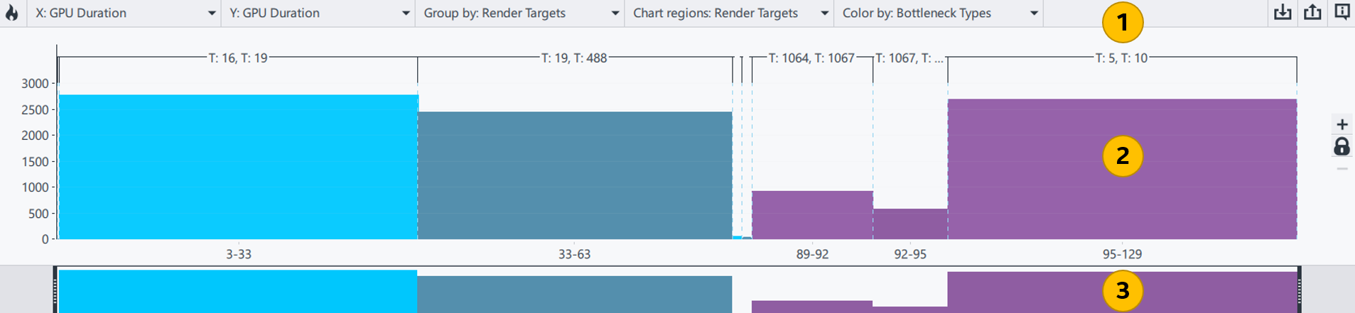
| Group by drop-down button | Groups the events visualized on the bar charts by:
|
| Chart Regions drop-down button | Enables a markup on the top of the Main bar chart to highlight the same groups that are available in the Group By drop-down list. |
| Color By drop-down button | Colors bars on the Main bar chart according to the types of events or bottlenecks. The button is available only if the system supports the full list of Intel performance counters. |
 Import button Import button |
Imports the saved metrics data onto the chart for comparison with the current metrics values. You can only import metrics data for the same frame file with the same set of metrics selected. If you import one or more CSV files into the bar chart, the X-axis is reset to a constant metric. |
 Export button Export button |
Saves metrics data in the CSV format.
Hover over the |
 Show Color Legend button Show Color Legend button |
Explains the color legend used in the Main bar chart for events and bottlenecks. Legend for bottlenecks is available only if the system supports the full list of Intel performance counters. By default, the bars on the Main bar chart are colored by event types. |
 rectangles above the chart to view the *.csv file names and associate the color code in the bar chart with the imported files. To remove the imported metrics data from the chart, click the corresponding rectangle.
 Main Bar Chart
The Main bar chart enables you to review individual events or groups of events and their contribution to the overall frame time.
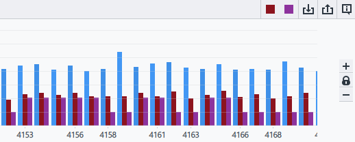
An event is any graphics API function that produces a GPU activity, such as "draw" calls or "clear" calls. Once you load the capture file, events are visualized as vertical bars, which can be of one of the following types:
- Draw Call (colored Dark Blue)
- Dispatch Call (colored Purple)
- Copy Call (colored Cyan)
- Clear Call (colored Green)
- Sync Call (colored Yellow) - DirectX 12 and Vulkan frames
- Render Pass Call (colored Magenta) - DirectX 12 and Vulkan frames
- Raytracing Call (colored Pink) - DirectX 12 frames
Events are shown in the GPU execution order starting from the left. By default, the height of an event bar indicates the duration of the event execution on the GPU. GPU time is measured in microseconds.
You can change the vertical scaling of the bar chart by increasing or decreasing the relative height of the bars using the  or
or  buttons respectively. Alternatively, you can hold Ctrl and scroll up or down to re-scale the bars.
To enable or disable the vertical auto-scaling, click the  /
/  toggle button. By default, the vertical auto-scaling is enabled.
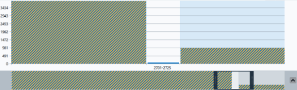
You can identify all events using a specific texture, buffer, shader, or render target selected in Resource List. You can see a colored stripe below each event using the selected resource. The color of the stripe depends on the group of the resource: orange for Input, green for Execution, and purple for Output resources. Half-transparent colored stripes indicate that the resource is used by some of the events in the render target.
To analyze metrics data and resources for specific parts of the frame, select a single event or a group of events in the bar chart. The selected bars are highlighted in orange. You can use the Ctrl+Z/Ctrl+Y keyboard shortcuts to return to the previously selected event and back.
If you select one or more events in the chart and group them by any criterion, for instance, by render targets, this partial selection within the render target is marked with orange hatching:
Frame Navigation Bar Chart
Use the Frame Navigation bar chart to navigate along the frame and to zoom into particular events in the Main bar chart.
To change the horizontal scaling of the Main bar chart, stretch or shrink the Frame Navigation bar chart scrollbar by dragging its boarders. The Frame Navigation bar chart provides an overview of the entire frame, while the scrollbar reflects the part of the frame currently displayed in the Main bar chart. If the X-axis represents a non-constant metric, you can double-click the slider to toggle between the full frame view and the currently selected part.