One of the core pillars behind Zenva Sky is to make computer science and coding more accessible and engaging for new audiences. Having a basic understanding of how computers and technology works is a must-have to be successful in the innovation economy, and current approaches to teach coding are not appealing enough for many people.
This is a problem we are very passionate about at Zenva, and it’s what’s driven us to create a top-quality and affordable on-demand curriculums in topics such as game development, machine learning and data science. Our mobile application Codemurai was a step towards gamifying coding education, with a focus on mobile-first generations and markets.
Zenva Sky is our chance to use virtual reality to onboard new generations and audiences into coding and tech. This includes both schools and self-learners from all across the planet.
Can a donut teach you coding?
Teaching is not just about the lesson content, it is also about creating an experience that is conducive to learning. This relates to aspects such as UX, design and art.
Until last week, Zenva Sky didn’t really have an art style. We had worked exclusively on content and functionality in order to make sure we could actually deliver some value to our users. When testing the app with different people both locally and at the Oculus Connect conference, people mentioned “lack of agency/purpose” as one of the main things to improve.
Thus, our work last week was focused on defining an art style and creating a beautiful world and environment where our coding lessons could take place.
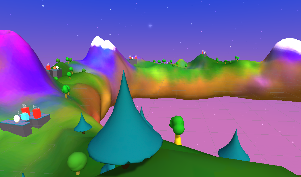
Introducing the donut world:

What we are calling the “donut world” was created in VR, using the sculpting tool Oculus Medium. The art style we went for was a what we are calling “homemade clay,” partly inspired in Super Mario Odyssey and other titles that appeal to a very wide audience.
Note: we haven’t created the definitive models for the coding challenge elements or play vehicle. We are also still adding props and details to the environment. The volcanos that you see will have nice cartoon particle effects and we are still debating whether to add a floating island in the middle containing the final challenge.

Why the donut shape?
A sense of progress is key in any educational application. The ring shape allows the user to view (almost) all the other challenges from anywhere. When a challenge is completed, the user will be flown to the next one. Completed challenges will feature a beam going to the sky and/or a nice particle effect.
Also, the answer can be "why not?" Everybody loves donuts, and VR gives us the possibility to create endless impossible worlds.
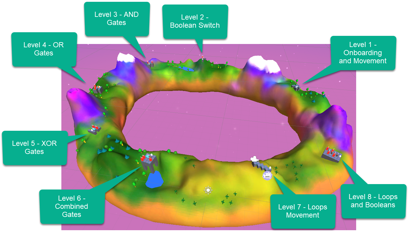
The 8 levels that we’ve completed so far have been placed in different parts of the donut world as shown below. For more detail on how each level works see our previous posts here and here.

Performance considerations
The current project hasn’t been optimized yet, but we did some quick tests to get an idea of the numbers and see if we were within the accepted ranges for desktop VR. These are the things we implemented:
- Disabled all real-time lights
- Set all environmental objects to static
- Baked all lighting and shadows into textures (Unity Lighting setting).
Things we haven’t done yet in this project, but have unlocked huge gains in past VR apps we’ve developed:
- Combining materials
- Experiment with different settings for shadows, lightmaps, etc
- Occlusion culling
- LOD (level of detail), including hiding distant elements
- Try out Unity's new Lightweight Pipeline to see if we get any gains
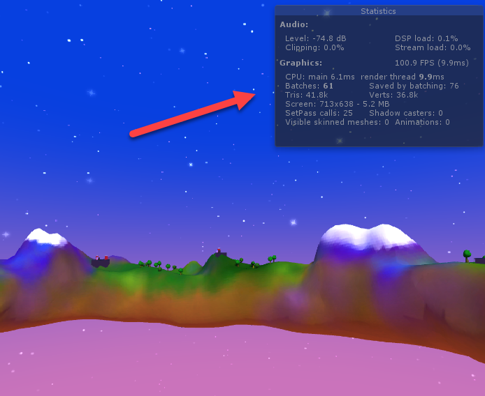
Let’s start by looking at our current numbers by running this in VR and activating the “Show Stats” option in Unity’s Play Mode:

- ~35-40k Vertices: This number is fine not just for a desktop VR but even for mobile VR! We can reduce this number further by applying some of the techniques described before. Since we do plan to add more models to the scene, this will be necessary.
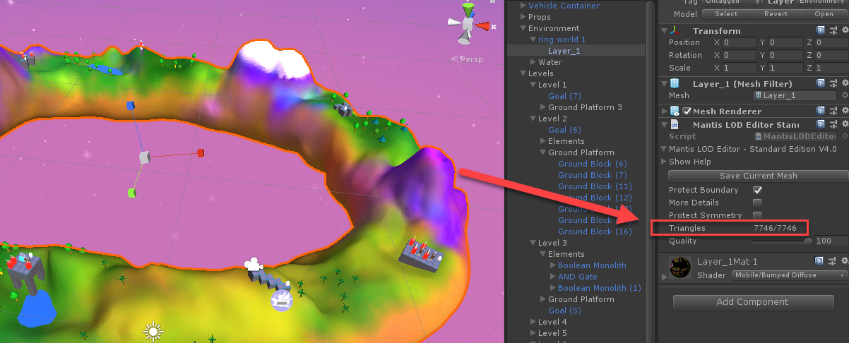
Around half of these vertices correspond to the terrain model, which could be optimized further and split into smaller chunks, so that only the parts that are visible to the user are processed. Just to provide a reference, the whole terrain is 7,746 triangles, down from over 2 million only using the Oculus Medium’s default export option. For his explanation on how low-poly models work when using higher quality normals and textures all credit goes to Bob Duffy's channel.

- ~60 Batches. This is not what we would call a small number, but it’s even fine for the lowest-end VR spectrum. We expect this number to decrease at least 50% by combining materials and replacing some shaders by VR-friendly alternatives (we are currently using mostly Unity's Standard Shader for the sake of quick prototyping, but plan do change to mobile-friendly and or Lightweight pipeline if we see gains).
Next Steps
Those of you who’ve been following our weekly updates might have noticed that we often divert from what we describe as a next step. The reason why this happens is because this is a new type of project, there is no thing such as a “learn to code VR app” genre or known classics we can base our blueprints upon.
When dealing with uncertainly and constant experimentation it’s had to even plan what will happen in a week’s time.
The only constant is the process of building, testing and learning. We have only one week left for this competition however this is only the beginning for Zenva Sky.
Our plan for this last week is to focus on usability and in improving lots of small details. In terms of main content and features whilst there is lots that could be added, the only item we are still missing before launching on Early Access is the ability to translate the code into real-world programming languages (most likely Python).
Other than that, it’s all going to be usability, UX, user on-boarding and art style until we launch!